As some of you may know,
Arthur Liu did the initial work on a
GTK+ interface for
aptitude last summer as
part of the
Google Summer of Code program. Since that program
ended, I've been working to complete the GTK+ interface, along with
some unrelated but similarly large changes to other parts of aptitude.
It's been a while since I've written anything about aptitude-gtk,
though, mostly because I set it aside for a few months to improve the
dependency solver.
While I'll probably be doing more work on the backend over the summer,
I also hope to get the GTK+ interface to a point where I can feel
comfortable including it in a stable release of aptitude. There are
two things that I want to be in place for the GTK+ interface before I
release it:
- The interface should be functionally complete, meaning that you
should be able to do anything you can do in the other interfaces.
- The interface should be reasonably straightforward to use and nice
to look at. This is a never-ending task, but there are some
pieces of the current interface that are particularly ugly or
awkward that I'd like to fix before release.
I've gone through the major areas of the current UI and marked them up
with notes about things that I think need to be done. This isn't a
definitive or exhaustive list, but it should give some idea of where
aptitude is and where it's going.
Dashboard Tab

The first thing you see when you start aptitude is the
dashboard
. This is a display that gives you immediate access
to some of the most common things you'll want to do: searching for a
package, viewing the available upgrades, and upgrading as many
packages as aptitude can figure out how to upgrade without removing
anything. This is one of the most complete parts of the interface,
but there are a few minor aesthetic things that I'd like to take care
of.
[UPDATE] Michael Johnson writes:
I agree with most of the notes on this screen. However, I'd like to see
the Selected Package changelog stay. I often look more than one upgrade
back. The summary doesn't show more than what's being upgraded. However, I
do like the idea of package description tab.
The search box should definately always be available. I found it annoying
when I had to click back to a different tab to get it.
One thing I definately miss from the console version of aptitude is the
list of recommended and suggested packages. I don't let aptitude
auto-install recommended packages, but I like to know what they are.
Packages tab

This is the view that's shown after you search for a package by name,
keyword, or by other criteria. It's also fairly complete, but there
are more things that could be added (mostly enhancements). Related to
this is the dialog box for editing which columns are visible:

Dependency solver tab

The dependency solver got a lot of love in the 0.5.2.1 release, and
it's now basically functional. There are some minor layout issues to
be fixed, and if I have time I'd like to add more ways of controlling
the resolver's behavior.
Package information tab

The package information page is probably the weakest part of the GTK+
aptitude interface; it wouldn't be too much of a stretch to say that
this tab is holding back a stable release of aptitude-gtk. The big
problem I have with it is that I feel that the information tab should
open up with an overview of the status of the package. What version
is installed, what's available, what archive is it in, who's the
maintainer, how big is it, etc. Instead, aptitude-gtk currently shows
you a big tree of all the package's dependencies. While that's
useful, it should be something the user chooses from.
I also find this tab to be visually unappealing, but I'm not entirely
sure how to fix that.
[UPDATE] Gunnar Wolf writes:
As you have mentioned in your blog post (quote this mail if you so
wish) that you want to make the package information screen "sexier":
I think it would be natural to integrate screenshots (from
http://screenshots.debian.net/) into it. Of course, it would be
worth measuring whether it imposes too high a load into that system
(maybe it should only get a screenshot if the user explicitly asks
for it) - but surely would be a net win.
I think this is a great idea and I'm definitely planning to
incorporate this feature.
[UPDATE] Michael Johnson writes:
One of the things I really like about aptitude-gtk over console-aptitude
is how obvious it makes some things. The version display on this tab is
one of those things. Maybe it could be more obvious, I don't know.
I agree, the dependency list is not the most important thing. And it's
missing the reverse dependencies. I use that more than the dependencies.
As far as the actual display of the list, I can't think of anything
besides a tree. Although the current implementation does feel quite clunky.
What I'd more like to see first is the list of files in the package. But I
can see how other people would have different priorties. So it should be
really easy to change the default view.
Preferences tab

One of the reasons that it is a stretch to say that the information
tab is holding aptitude-gtk back is the preferences tab, which is a
huge pile of not-yet-implemented-ness. In fact, it's not even
designed, let alone implemented. Releasing a GUI program with no
way to alter the settings strikes me as ... silly.
Preview tab

The preview tab is a bit weaker than the packages tab, in my opinion,
but much stronger than the information tab. Like the information tab,
I find it visually unappealing, but I'm not entirely sure how to
improve it. I'm currently leaning towards the
paned browser
idea.
[UPDATE] Michael Johnson writes:
I've never been comfortable using this tab. It never made much sense to
me. I think the last one or two times I used aptitude-gtk it started
making sense, but that seems to be too long a time. I think it's the mass
of text at each top level entry. The console version has brief
descriptions with more info in the details pane when the entry is
selected. Perhaps healthy use of tool tips or an info pane would help with
this.
The paned browser idea sounds promising. I think it will be easier for new
users to follow. And it provides a natural way to provide more information
on what each section is about.
That's all folks!
 There will be a general meeting on the #koha IRC channel on Wednesday, 6 May 2009 at 19:00 UTC with a nominal finish time of 21:00. To convert to your timezone, try date -d @1241636400 (thanks to SPI (Joerg?) for that idea).
The meeting will include Koha 3.2/tip status and timeline, Koha 3.0.x status, Koha bugs database, KohaCon 2009 report. The full agenda is on the wiki.
Connection details are shown on the wiki front page but are basically irc://irc.katipo.co.nz:6667/#koha
Hope to see you there, or a summary should be linked from the comments here later.
 I have just uploaded
 Since Lenny was the first Debian release to feature CUPS under its new package naming strategy, I started going through 'rdepends' results to see which packages in Squeeze still present dependencies for *cupsys* packages.
Much to my amazement, there's quite many.
If you are the maintainer of a package that still has those dependencies, please fix them ASAP. Alternately, if you're aware of any favorite package that does, please do not hesitate at filing a patch to help the maintainer update their debian/control.
Comes June 2009, transitional CUPS packages will be removed from our debian/control.


 Apparently
 Providing city services only to users of specific proprietary software is bad public policy. I just discovered that New York City's
 It took me a while because of travel and other projects, but I finally
released a tar ball containing Debian lenny for the SheevaPlug along with
some

 Older (up to the *60 series) Thinkpads have a slightly odd mixer setup. There's a mixer stage that sits between the software controllable mixer and the speakers. This is controlled by the firmware in response to the volume keys being hit and can't be prevented by the OS. This is unfortunate, since users are quite enthusiastic about seeing an on-screen display when they hit various keys and if we do the obvious thing and map the volume keys to KEY_VOLUMEUP and KEY_VOLUMEDOWN then they get the OSD but also get their software-controlled mixer changed at the same time as their firmware-controlled mixer. This causes boundless confusion.


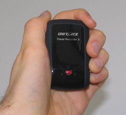 Spring has arrived in Europe and I'm looking forward to spending more
time outdoors. While I was pondering some plans, I thought it would be
nice to have a GPS. I've never used a GPS before but it seems it will
allow me to combine outdoors activities such as walking and hiking with
geek things. In particular, I'm interested in tracking where I'm going
(what route, what distance, what speed, etc), geotagging photos and
possibly contributing to OpenStreetMap. Since last week, I have a
Qstarz BT-Q1000X (Travel Recorder X), a GPS logger and receiver, and
I've been playing around with it a bit. This device uses the new MTK II
chip, which gives good accuracy and long battery time.
I've created a new gps category in which I'll share my
experience using a GPS in general and specifically the Qstarz BT-Q1000X.
I've also created a


 (The much-delayed part 2 in an ongoing series: shiny things in
telepathy-glib)